Best practices for logo design
A logo is a graphic form, inscription or symbol that is the foundation for company identification. Its task is to emphasize the individuality of the company and draw the attention of the recipient. A company without a logo is like a man without a face, which is why it is so important for the logo to stand out from the competitions. However, in order for it to be recognizable, it is necessary to go through several stages that will help to create a good symbol. I will present the stages of my work on the logo for one of our clients - Molendini.
1. Preparation
At the very beginning, you need to read the brief and specify the individuality of the client. Then it is worth checking the current website and company logo (if there is any) in order to recognize the climate with which the customer has been identifying thus far. After the initial analysis and collecting the competition's logo, I created a list of schemes that are repeated in a given industry, which I cannot use. Based on this I came to the conclusion that I would bet on an elegant style with a hint of vintage.
2. Mood board and first sketches
Mood board is simply the board with inspirations. It is worth creating a new folder and put things in it that we like and can give direction to our initial vision when looking for inspiration for the project. It is also good practice to create so-called mind maps, i.e. matching words that we associate with the brand name.
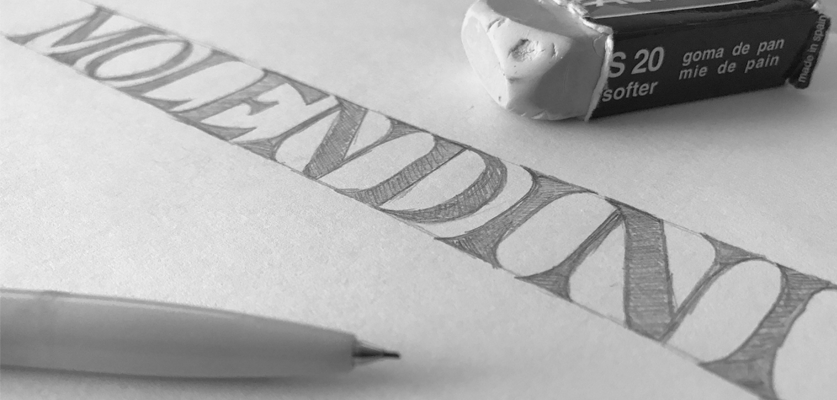
With solid resources of inspiration, let's not try to create a logo in the program at all costs, let's give traditional methods such as paper + pencil a try :). However, don’t forget about three important features of the logo:
1) Simplicity
2) Recognition
3) Timelessness
When we get a satisfying effect, we take a picture of the sketch and transfer it to the graphics program.
3. Graphic program
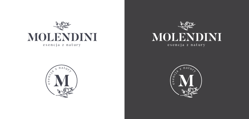
In the graphical program, we block our layer with a sketch, reduce its opacity and try to reproduce what we have drawn on the new layer. In the case of Molendini, the main role in the logo plays the typography (you do not need to create a symbol at any price), so the most important thing was to choose a font that matched my vision. After a long search (do not hurry with the choice of typography, because the wrong font may negatively affect our implementation), I put on the Butler font. Finally, an olive branch appeared above the typography, which added the character to the whole, and at the same time did not overpower the name of the company. In addition, a simplified version of the logo has been designed, which can serve as a stamp or a trademark of the company.
4. Color scheme
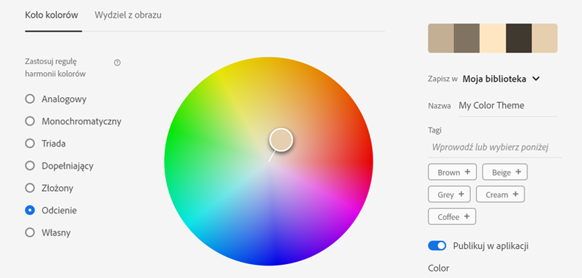
To emphasize the elegance and tradition of the brand, the logo has been designed in B&W colors. When designing other logos, make sure that it looks good in one color - black, and only then select the colors. It is important not to overdo it with the number of colors. A good looking logo is one in which there is max. 3 colors. The choice of colors is most often dependent on the character of the logo itself and its recipients, as well as the feelings they are guided by. For colors to work together, it's a good idea to use Adobe Color or another color wheel.
5. Brand book and visualization of the logo
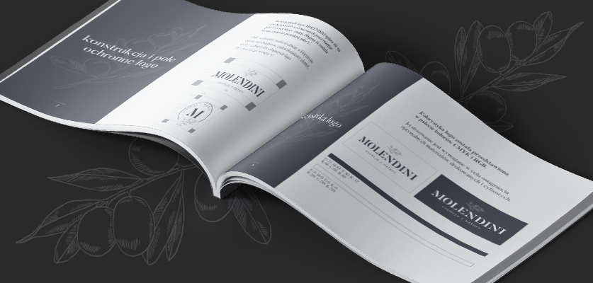
After the logo, the design stage is completed and both us and the customer are satisfied, the result is a visualization of the logo. It is good to present the logo on business cards, office paper, envelopes, etc. In the case of Molendini, the logo has been presented on product labels and paper bags. The next step was to create a brand book, in other words, the instruction manual of the logo and its dimensioning. Observance of the rules contained in the brand book enables maintaining the correct coherence of the company’s logo and creating a uniform image.
Of course, the stages of logo design can be much more and they can be more extensive. The design process of Molendini ran smoothly because it almost completely bypassed the choice of colors.


